In an era where digital experiences span a multitude of devices, the importance of responsive design has catalyzed a revolution in the way websites are conceived and developed. The Responsive Design Revolution is not just a trend; it’s a fundamental shift that acknowledges the diversity of devices users employ to access the web and aims to provide a seamless experience across them all.
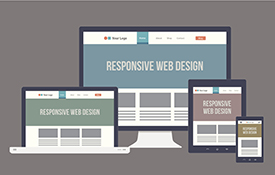
Responsive design is a design and development approach that allows websites to adapt dynamically to various screen sizes and resolutions. As the digital landscape evolves, users no longer limit their online interactions to traditional desktop computers. Smartphones, tablets, and a myriad of other devices have become integral parts of our daily lives, demanding a website design that effortlessly accommodates these diverse platforms.
The cornerstone of responsive design lies in fluid grids, flexible images, and media queries. These elements work in harmony, ensuring that a website’s layout and content automatically adjust based on the screen size, creating a consistent and user-friendly experience. The revolution lies in the departure from fixed, static designs to fluid, dynamic layouts that cater to the specific characteristics of each device.
The benefits of embracing responsive design are manifold. Not only does it enhance user experience by providing a consistent look and feel across devices, but it also contributes to improved search engine rankings. Search engines, like Google, prioritize mobile-friendly websites, recognizing the importance of catering to users accessing information on the go.
The Responsive Design Revolution extends beyond adaptability; it fosters an approach that emphasizes performance and speed. Optimizing images, leveraging browser caching, and adopting efficient coding practices are integral components. This focus on performance not only enhances the user experience but also contributes to the overall success of a website.
As we navigate this revolution, it’s evident that responsive design is not merely a feature but a standard expectation. Users anticipate a seamless transition from desktop to mobile, and businesses recognize the impact of delivering a consistent brand experience across all touchpoints. The Responsive Design Revolution challenges designers and developers to think beyond the confines of traditional web design, encouraging a mindset that prioritizes adaptability, accessibility, and user satisfaction.
In conclusion, the Responsive Design Revolution marks a paradigm shift in the way we approach web design and development. By embracing this revolution, businesses and designers alike pave the way for a digital landscape that seamlessly adapts to the ever-changing ways users engage with online content. Responsive design is not just a technical solution; it’s a commitment to delivering a user-centric experience on every device, ensuring that the web remains an accessible and enjoyable space for all.